Visualizing international flows with Geoflow visualizer
In this tutorial we present Geoflow, a newly created tool designed to visualize international flows in an interactive way. The tool is free and open-source, and can be accessed here. It is designed to visualize any international flows like, for instance, cash or migration flows. Since it’s easier to understand its capabilities by using them, we’ll start showing a couple of examples of what Geoflow can do. After that, we briefly explain how to upload your own dataset and visualize it using the tool.
What Geoflow can do
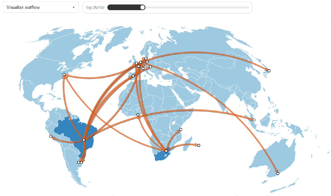
For these examples, we use the included demo dataset showing investments in fossil companies across countries. Figure 1 shows the top 10 investments in fossil fuel companies from China. The visualization is straightforward: the arrows indicate in which countries these investments are located. By placing the cursor on top of Bermudas, its arrow gets highlighted, showing the flow strength (weight), as well as the inflow and outflow country. Figure 2 is a barplot that shows to which countries most investments go to: in this case, it is mainly Singapore, followed by the Netherlands.


In general, in the tool we can select the source and target countries for which we want to see the flows. There is also an option to select source or target for a country, which is useful when we want to focus on one country: for example, selecting all flows into the Netherlands or from the Netherlands. Besides, we can select the number of flows to visualize in the upper part. Lastly, we can select whether we want to visualize the inflow or the outflow. This last option changes the colouring of the countries (colouring either the inflow or outflow countries), and it also changes the barplot visualization.

How to use Geoflow for your visualizations
It is very straightforward to use Geoflow for your own visualizations. You only need to upload a .csv dataset to the app with the following columns:
- Source: the source of the flow, written in ISO2 format.
- Target: the target of the flow, also in ISO2 format
- Weight: strength of the flow (e.g., the number of migrants, or the financial revenue)
Additionally, you can add:
- Year: If year is present, a new visualization on the bottom right panel shows a time series for the flows. You can see it in Figure 4 below.
- Other columns: They will be interpreted as categorical variables. This allows you to split the flows into categories, as shown in Figure 5
It is a requirement that the data format is .csv and the name of the variables are source, target, weight and (if included) year, so note you might have to reformat your data to use the tool.


Conclusion
In this tutorial we have shown you how to use Geoflow for your own visualizations. We have shown what the Geoflow capabilities are, and how to upload your data to use it. We hope you’ve find it inspiring!
Geoflow is open-source and has been developed by Peter Kok, Javier García Bernardo and mbabic332. If you use the tool, you can cite this Zenodo repo, with a DOI. If you wish to expand on Geoflow, you can check the source code here, and contribute or build on it. The tool is written using JavaScript.